Home » Home Decor » Tips for seamless furniture settings in your room
You may buy the most appealing pieces of furniture for your interior. But your efforts won’t achieve much if the purchased materials are not arranged well.
Poorly placed furniture disrupts the balance of a room’s interior design. It also obviously affects your convenience – which is what a home is about, right? If you can’t move around easily after arranging the furniture, then you need to make some changes.
For starters, it is important that you don’t focus too much on buying pieces that only offer aesthetic value. You should also prioritise proper placement.
Those who are new to interior designing often find this latter task difficult. Still, it remains an important interior decorating decision.

For seamless furniture arrangements, every time, consider the following tips:
Leave space for foot traffic
When you see an empty room, it can seem ripe for decorating. But as you begin to fill it, it may gradually seem less so. In this respect, it’s important to not let your design layout become too overwhelming.
Yes – there are certain ways in which you can prevent this from happening. Even if you are going for a maximalist theme, there are several rules that you need to follow.
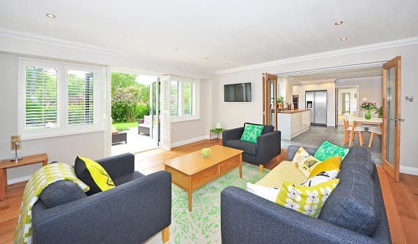
A room overflowing with furniture pieces will lack proper space for foot traffic. This is an unacceptable inconvenience, especially in the main living spaces. In such cases, a wise rule of thumb to follow is to leave at least three feet of walking space between neighbouring furniture pieces.
Arrange around the focal point
Defining a room’s focal point makes up a basic part of every interior designing effort. And your furniture placement should play to its advantage. For instance, if the accent wall in your living room is the focal point, then the sofas should face it.
Working around a room’s focal point is a great way to dictate furniture arrangement. This also helps to keep viewers’ eyes focused where you want them to.

Define the room’s balance
Balance is a key interior designing principle. Many homeowners enjoy a lack of symmetry in their rooms. Yet, decorations do not work, beyond a certain extent, without achieving balance.
The question is: what is balance in interior designing?
Balance, simply put, is the distribution of colours, texture, visual weight of objects, and space. For example, if you place a tall lamp in your room, consider balancing it with a hanging decoration. In a similar way, patterns can be used to balance the colours in a room.
Create ‘zones’ for open-plan spaces
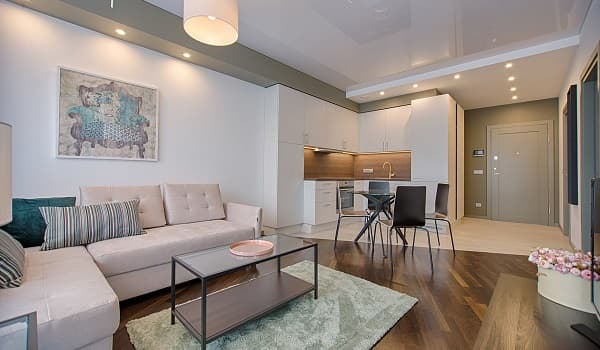
If you maintain an open-plan living space, you can use specific furniture placements for creating a number of ‘zones’. Depending on your lifestyle needs, these zones can be used for various functions.
As an example, you can separate the living room area by facing your sofas’ backs to the rest of the room. A group of chairs with a small table can be turned into a reading or conversation corner.

Don’t overreach for space
When aiming to create spacious rooms, amateur designers might feel comfortable with furniture pushed against the walls. While this arrangement does give you ample space, it does not always look appealing. And with all things considered, it is most suited to rooms with compact spaces.
Word of advice: Don’t apply this type of setting to make a reasonably-sized room airier.
You can achieve the same effect by leaving at least 12-inches between your walls and your furniture.
Main furniture piece comes first
Use this as a trick to streamline furniture placements in your interiors.
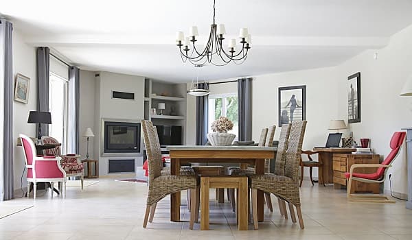
Every room has one main piece of furniture. Take, for instance, the bed in the bedroom, and the dining table in the dining room. You need to decide the correct placement for this piece first. Just know that your chosen arrangement should not disrupt the flow of traffic and convenience of using the room itself. Ensure that it does not block any doorways or windows.
Once you have set the main piece in its proper place, the other furniture arrangements and décor will probably highlight it. Like the main piece, these other materials should not block the traffic flow either. They also need to meet the laws of scale and proportion in a room.

There is one main take away from all these tips. When deciding on furniture placements, it’s a good idea to choose function over form. If you can’t use your room the way you need it, then even the most beautiful arrangement styles become pointless.
If you’ve got any insightful furniture placement ideas of your own, please share them with us in the comments section below. We’d love to hear from you.


