Home » Home Decor » Common Home Decorating Mistakes You Need to Avoid
Who doesn’t want their home décor to look lavish and expensive? Although we all try our best to make our places look clean and tidy while trying to follow the latest interior design trends, most of us end up committing some serious decorating faux pas that usually results in a tacky-looking home. Now, ‘decorating’ is a fairly broad term. It not only includes the furniture you’ve picked or the art you’ve chosen to display on your wall, but it also comprises the colour palette of your home and the moulding on the ceiling. Therefore, when it comes to spotting home decorating mistakes, you need to look at the bigger picture instead of focusing on just a few elements.
Decorating your home can be a tricky business because while it’s important to incorporate your own personality into your décor, it’s also important to keep an eye on things that might be bringing down the aesthetic value of your home while having no substantial impact on your lifestyle.
Since we have all been guilty of committing some decorating mistakes, which is perfectly fine as long as you spot it in time, here are some of the most common mistakes that you need to avoid.
Common Home Decorating Mistakes to Avoid
While a few of them may not seem so bad, these are some of the worst decorating mistakes you can make:
- Buying cheap furniture
- Blocking natural light
- Lining furniture against the walls
- Going overboard with throw pillows
- Hanging photo frames and artwork too high
- Choosing really small rugs
- Low hanging, short curtains
- Having too much of the same fabric
Let’s discuss each of these home decorating mistakes and their solutions in a bit more detail.
Buying cheap furniture
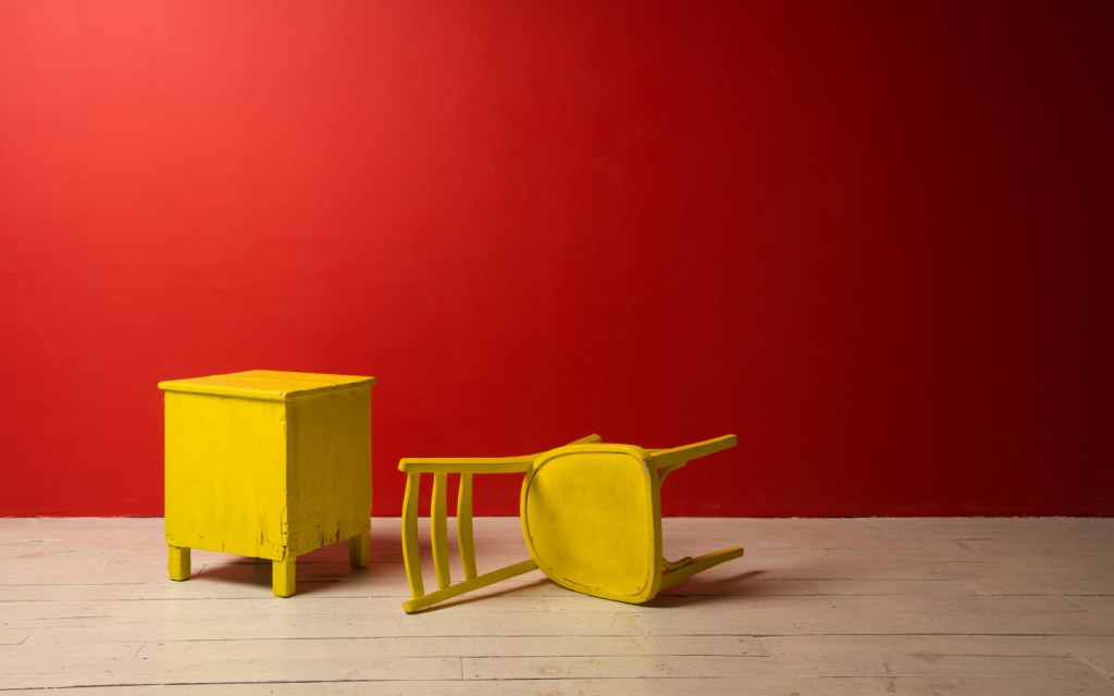
You should always buy what you can afford but never compromise on quality.
It can be extremely tempting to buy trendy designer knock-offs online (for obvious reasons), but it’s important to know that filling your home with cheap items is one of the biggest home decorating mistakes to avoid.
If there’s a certain item you want to purchase, a new coffee table, for instance, it’s advisable to wait for a while and save up for it rather than spending your money on a low-quality table that would neither last for a long time nor would it add any value to your décor. As for items that you absolutely need, such as a new bed or a set of chairs, it’s better to buy the best quality available within your budget instead of opting for a cheap version of a trendy article.
Blocking natural light
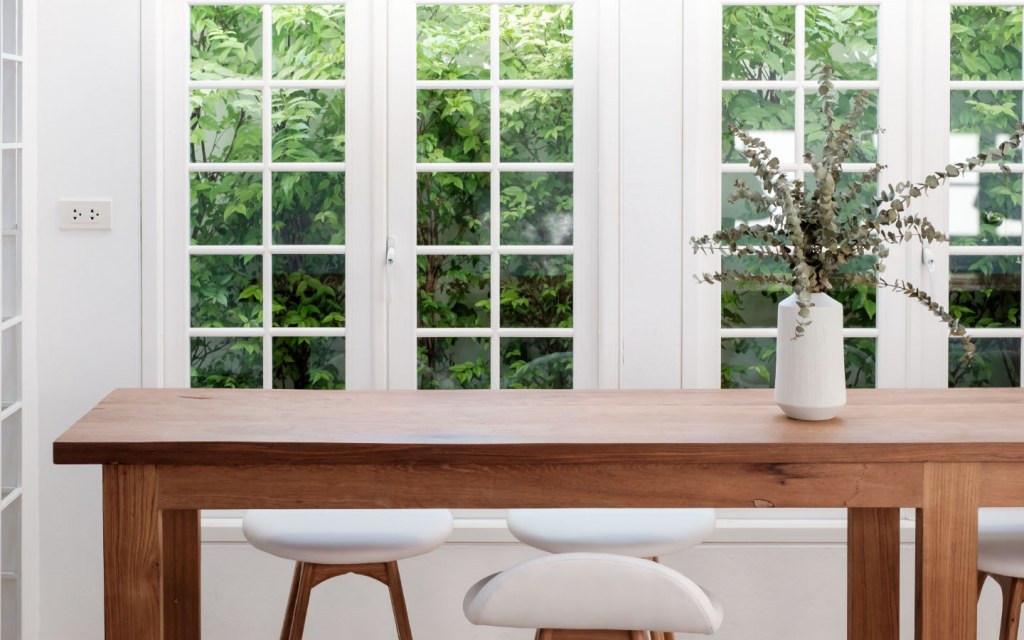
Rooms that don’t receive a lot of natural light tend to look smaller and more cramped than they actually are.
A lot of times, homeowners tend to decorate their rooms in a way that keeps the sunlight from streaming in. They either choose thick, heavy drapery in an effort to make their décor look more lavish or place tall pieces of furniture directly in front of the window. Needless to say, it is one of the most common interior design mistakes to avoid while decorating your home.
If a certain piece of furniture is taller than your window sill, place it somewhere else. This is particularly important for rooms with small or single windows. As for the fabric of your curtains, go with neutral-colour linen. In case that’s not an option, hang sheer curtains under your heavy drapes for a more finished look.
Lining furniture against the walls
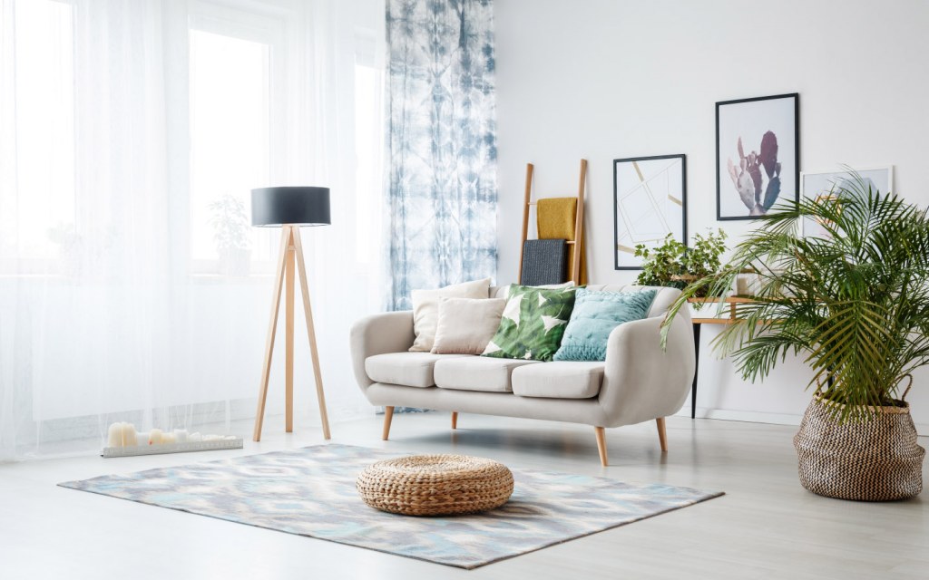
Decorating smaller spaces can be a bit of a challenge. However, pushing all your furniture against the walls is one of the worst decorating mistakes you can make. According to interior design experts, leaving some room to breathe between your furniture and walls can make your home feel more spacious and less cramped.
While lining furniture against the walls creates extra space in the middle, it can also make your home décor look outdated and your space restricted.
In case you are struggling with decorating a small room, move your furniture a few inches away from the wall and put a big mirror between the two. Tucking a big mirror in tight spaces helps break up the visual clutter and makes space look less confined. Although this hack may not be practical for bedrooms and nurseries, you can easily incorporate a mirror in your living room and drawing room décor.
Also, here are some other ways you can use mirrors to make your home look a lot more spacious.
Going overboard with throw pillows
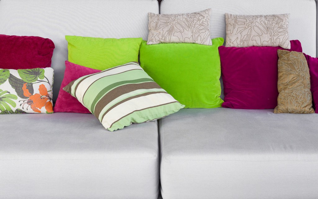
Incorporating throw pillows into your décor is perhaps one of the best ways to add colour to your home without using a paintbrush. But if you have to move a bunch of pillows around before being able to sit on your couch or lay down on your bed, it’s high time you get rid of a few of them. While interior designing magazines and store catalogues may feature pictures of couches filled with a dozen of mismatched throw pillows, most experts advise against it. In fact, it is one of the biggest decorating trends to avoid if you want to make your décor look elegant and cohesive.
In addition to that, as pretty as they might look, avoid using tiny accent pillows – especially in your drawing-room.
Hanging photo frames and artwork too high
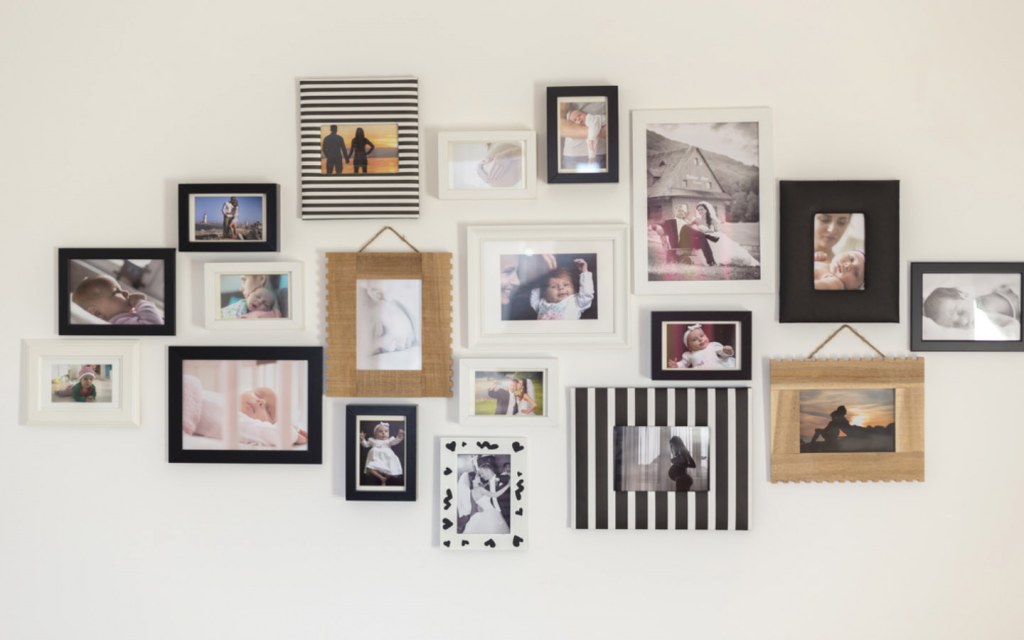
Have you created a wall gallery to make your plain, boring wall interesting? Good.
Do you have to crane your neck to see it? Not good.
Whether you have decorated your walls with artwork or family photos, make sure to hang it at about eye-level. There are no set height limits for such pieces, but one of the most common home decorating mistakes people make is to hang such pieces higher than they should. Wall art should be too close to the ceiling – unless it’s a big, floor-length piece.
For all the DIY-home decorators out there, some interior design experts suggest tracing frames of your artwork onto paper and tape those cutouts on your wall to figure out the best position to hang it.
On a similar note, too much empty wall space around a small piece of art or photo is also not a good idea. Unless it’s a statement piece, compliment the lone decoration on your wall by incorporating more artwork or pictures around it.
In case you’re out of ideas, here are some rather ingenious ways to upgrade your walls without going over your budget.
Choosing really small rugs
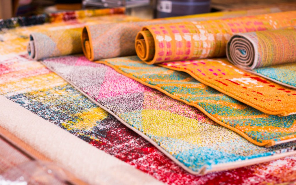
Placing small rugs in the centre of big rooms is one of the most common decorating mistakes people make. A small rug can give your space a boxy feeling, which is the exact opposite of luxury living.
Ideally, all of your furniture – or at least the statement pieces – should be sitting on the rug. This is why you should always opt for larger area rugs. In case your budget doesn’t allow you to splurge on a bigger piece, since it can be quite expensive, avoid using one altogether.
However, if you absolutely have to incorporate a small area rug into your living room or drawing room décor, make sure at least the front legs of the solid, bigger pieces are placed on the rug. As for smaller furniture, such as chairs and coffee tables, all four of their legs must be on the rug.
Low hanging, short curtains
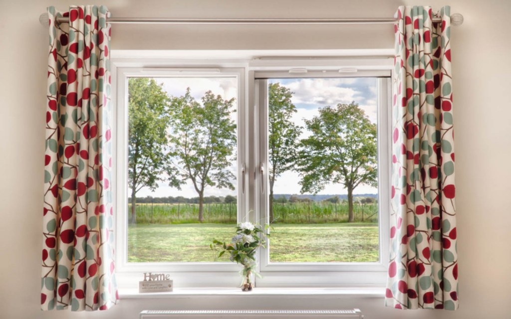
Did you know that the placement of your curtains can make your walls look shorter or taller than they actually are?
Well, now you do.
Opting for low hanging curtains is one of the most common decorating mistakes. The same goes for choosing short curtains or drapes.
The thing is that you can make your ceilings look high by installing your curtain rod only an inch or two below them. Also, always go for floor-length curtains instead of ones that end right below the window sill. Floor-length curtains not only look a lot fancier than the shorter ones but also create the illusion of a bigger space.
Pro-tip: Spray paint your curtain rings a nice shade of golden or replace them with then expensive-looking napkin rings for a more elegant look.
Having too much of the same fabric

Last but not least, filling you home with a lot of patterns or matching fabrics is one of the most overlooked interior design mistakes. When choosing your curtains, for instance, always opt for materials and colours that stand in contrast with the rest of your décor. Going for exact matches can make your home décor look cheap and tacky.
Not to mention, a variety of patterns can make your décor look a bit confusing. Though you should not completely avoid it since patterns can add texture to an otherwise boring-looking room.
Incorporating patterns is also a great way to make your bedroom look warm and cosy on a budget.
So, that’s our wrap for our pick of the most common decorating mistakes to avoid. You should keep these points in mind while decorating your home, though make sure you don’t end up putting style above comfort in a bid to follow the latest trends.
For more home décor tips and tricks, head over to Zameen Blog – the best lifestyle and property blog in Pakistan. If you have any suggestions with regards to the topic or have a question that you want to ask, send us an email on blog@zameen.com.
To stay updated about the latest developments in the real estate sector of Pakistan, subscribe to our newsletter on the right.


